Description
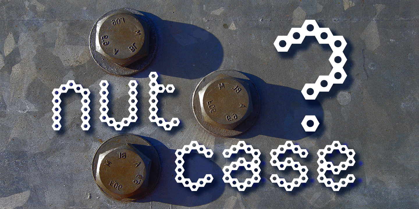
Nutcase is a perfect example of a font that principally designed itself.
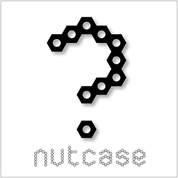
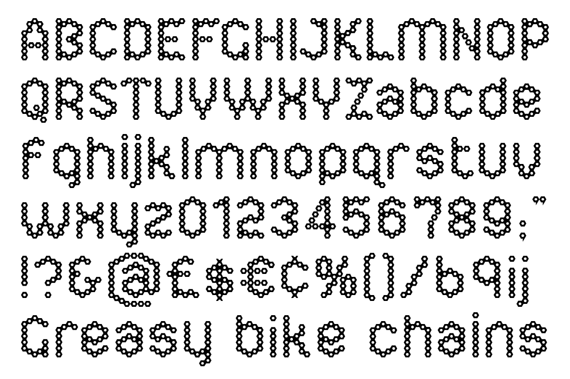
I created a hexagonal template (the most economical form in nature by the way) and took out the centre to increase the decorative element. I played around with it, creating some pleasing letterforms and it soon became clear the design would translate into a complete alphabet, so I set to work applying the idea to both upper and lower cases.
It wasn’t all straight forward though, avoiding awkward characters and retaining legibility took a little perseverance, but it eventually paid off.
I thought of this primarily as a decorative display face but it reads surprisingly well as body copy too.


