Groovy typeface
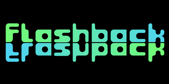
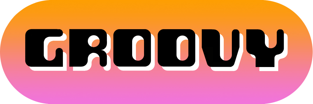
Groovy started out as a prospective variant in the ‘Flashback’ series but very quickly established its own distinct appearance, especially with the lower case letters blending into the format so well.
There wasn't any preconceived idea to design a retro looking font in principle, it simply evolved that way, but I do think it has several characteristics reminiscent of style genres from the '70s. It’s probably quite subliminal and like me, you may find yourself thinking, what does that remind me of?
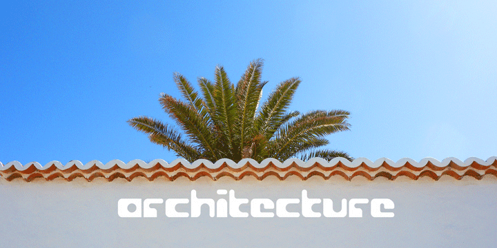
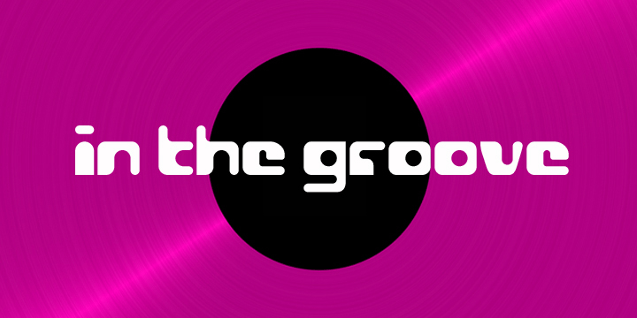
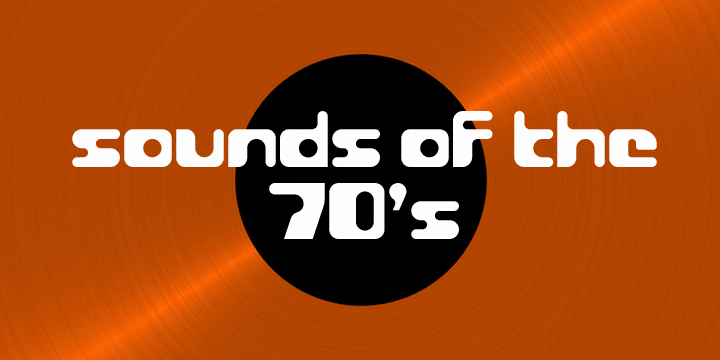
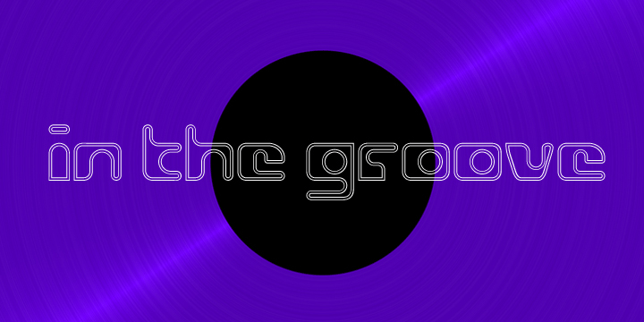
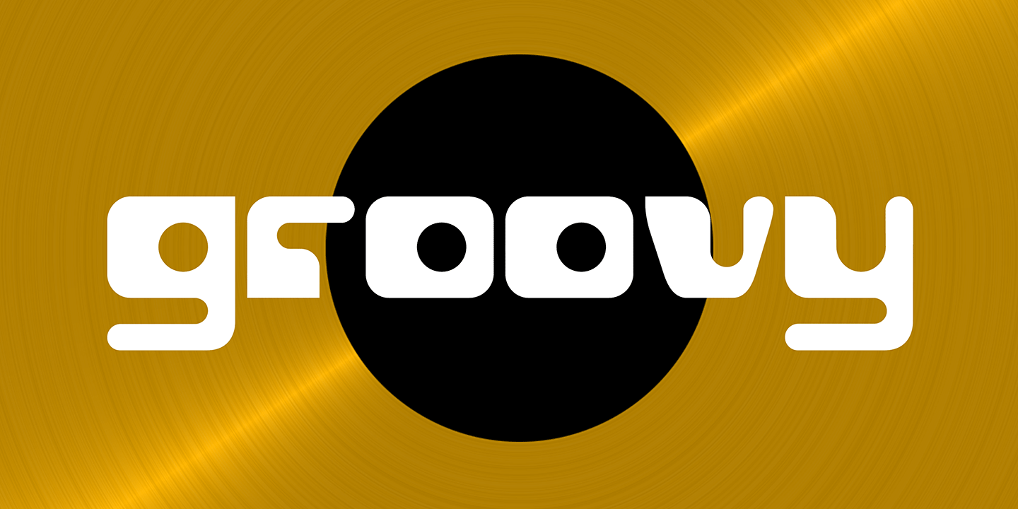
The double-entendre'd title is quite apt too, not merely for reasons of its outwardly retro appearance but also because of the considered, rounded elements forming the negative spaces throughout. The font also has quite a chameleon-like personality, being capable of having both a trendy / fun appearance, and/or something solid and stylish, depending on the use, as demonstrated in the banner examples here.
An inline version of the font complements the solid variant and allows for even greater versatility.