Somatype Family
As with any attempt at a new typeface, you want to create something different. A difficult task as most legible fonts are based on something previous.
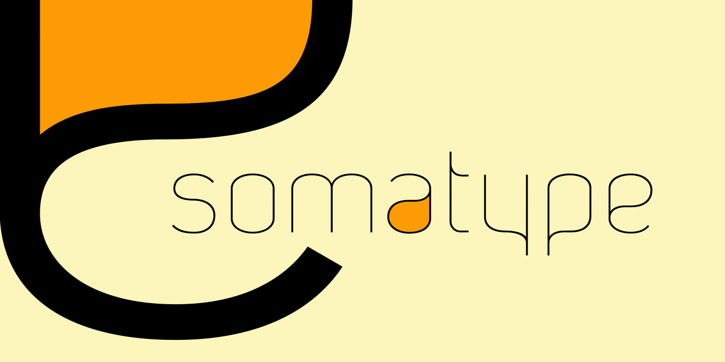
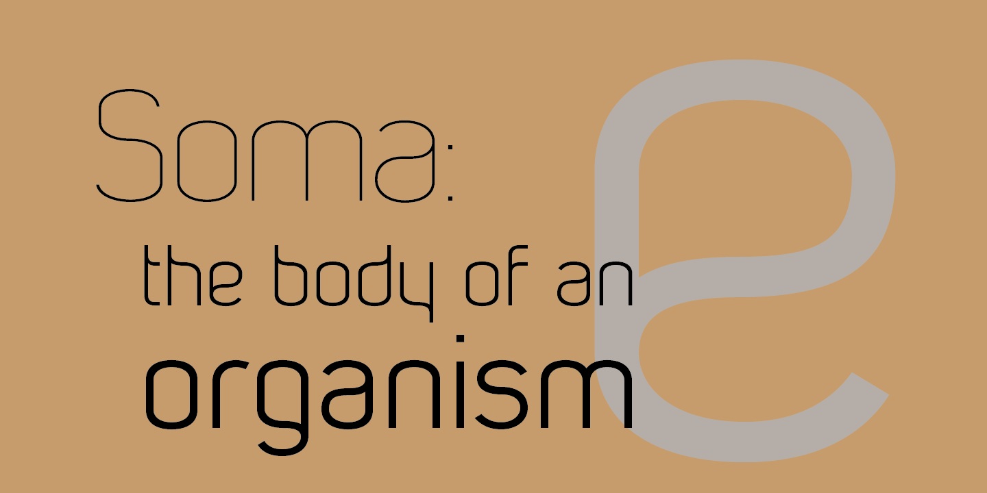
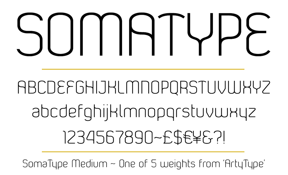
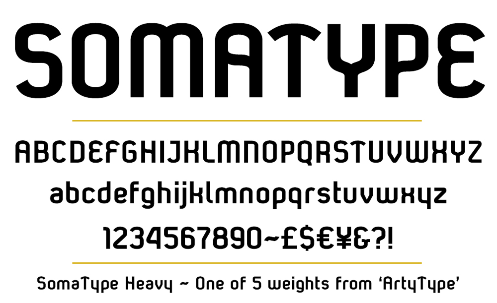
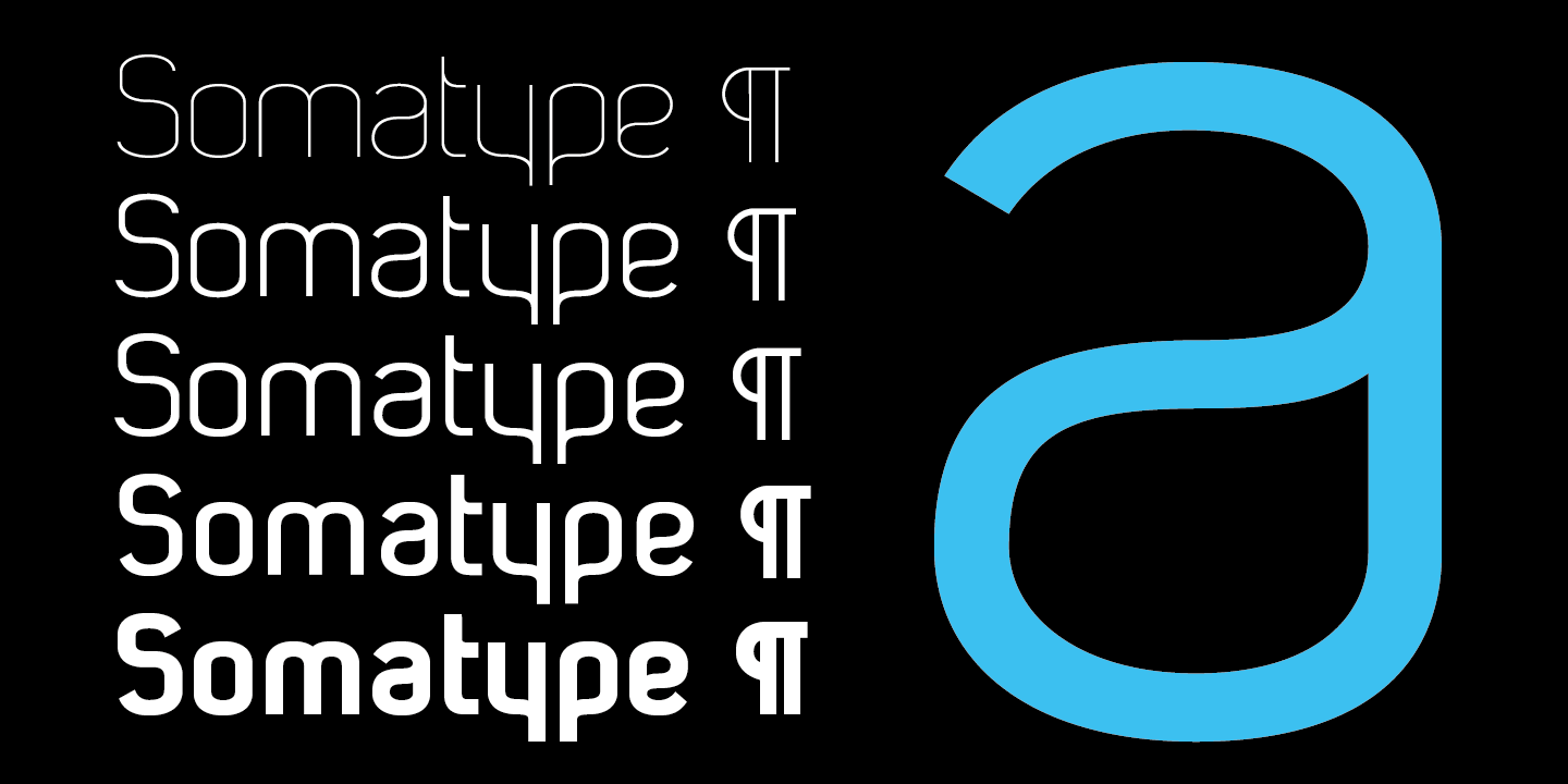
Somatype isn't actually based on any particular font but it has unavoidable similarities to others. The important difference here being the distinctive quirk of the connection points going opposite to the norm; exemplified best by the lower case d & e.
Once devised, the unique characteristic was applied wherever possible, keeping the rest of the characters in a sympathetic, rounded style.
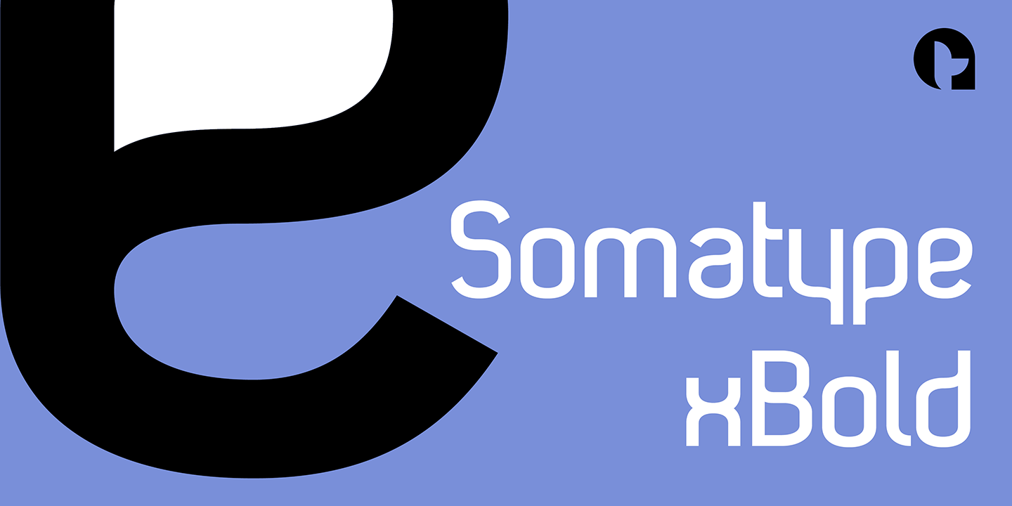
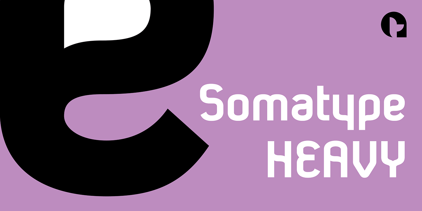
I first designed this in the light weight version, seeing it working best as a large open display font for magazines etc. but realized it would be too light for body copy at small scale, so, medium and bold weights were created to resolve that issue.
Incidentally, the word ‘somatype’ literally means body-type.
