Description
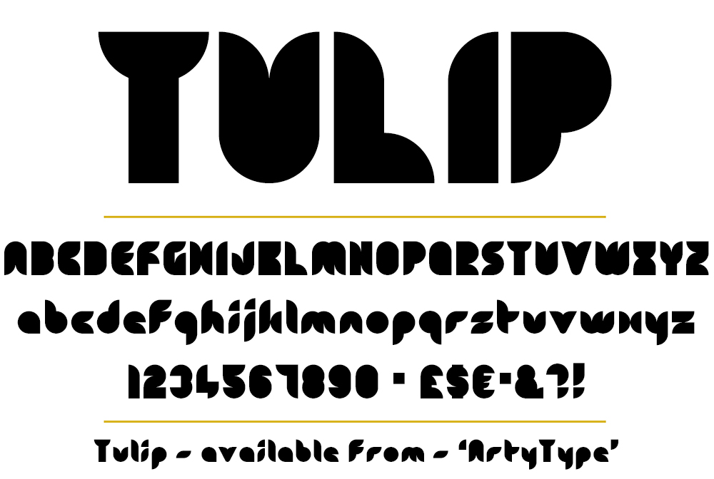
I’ve had an interest in typography ever since my college days, even submitting my NDD thesis on the subject. The basic concept for the Tulip font stems from that early creative period, hence the obvious 60’s retro feel. It’s only recently that I’ve had the chance to fully carry through some of my dormant typographic ideas, but ‘better late than never’ as they say!
The font’s characteristic style is based on repeating or rotating templates of a half and a quarter circle, the geometric, modular building blocks used here. The name was simply influenced by the letter ‘u’, which visually describes a stylized ‘tulip’ flower.


