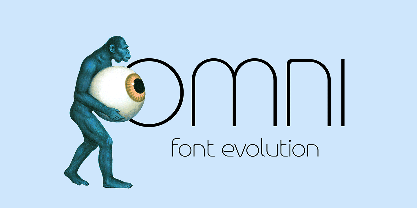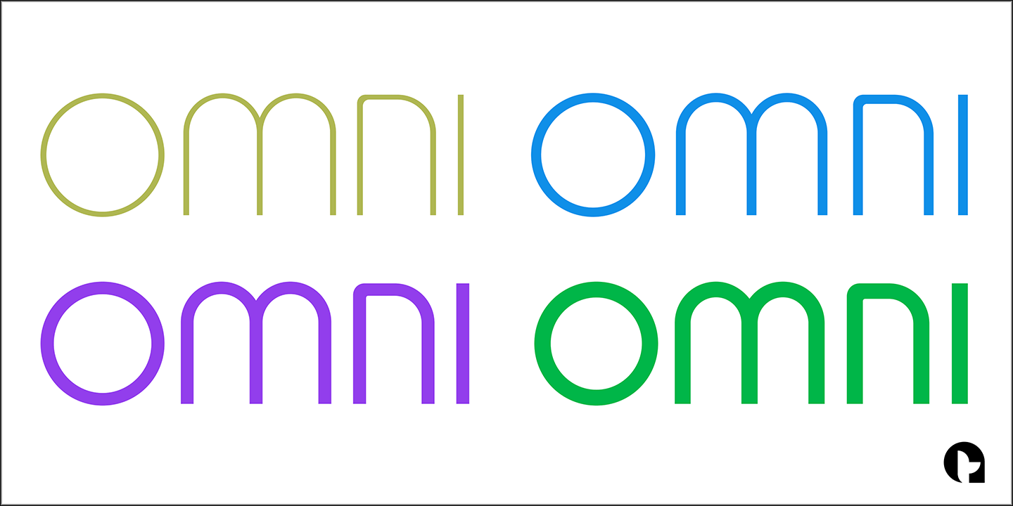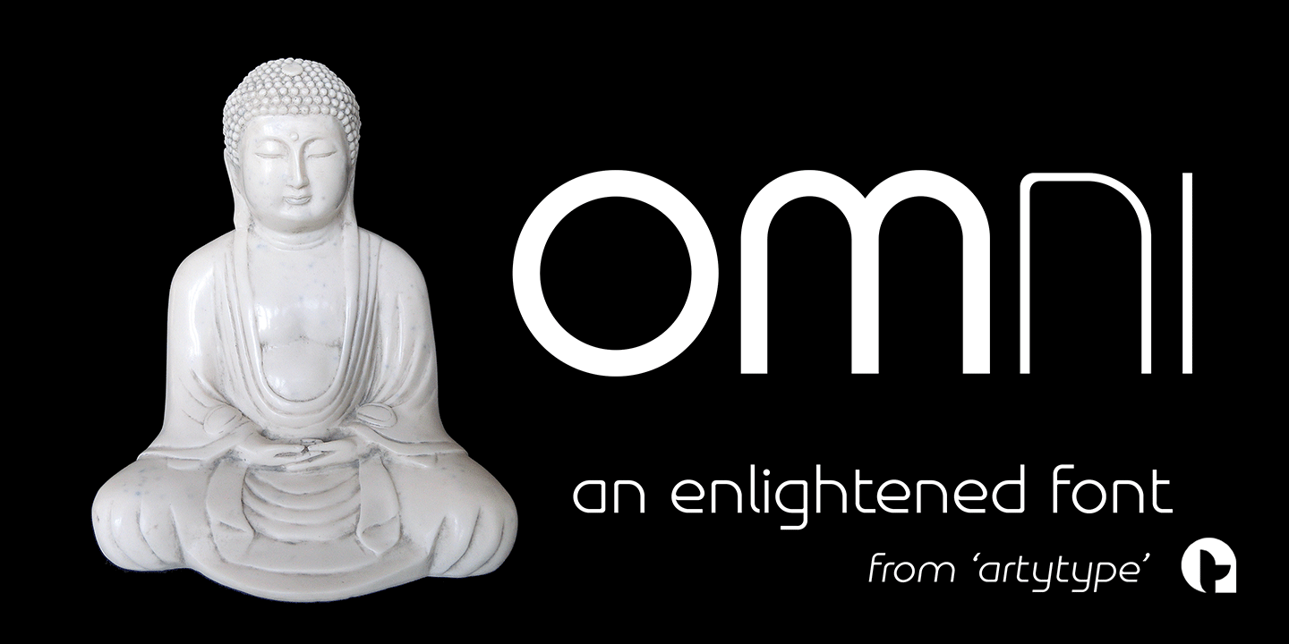
Omni Type Family
Typefaces don't simply appear fully formed to a designer, even with a clear concept in mind; they evolve naturally during the design & development process.
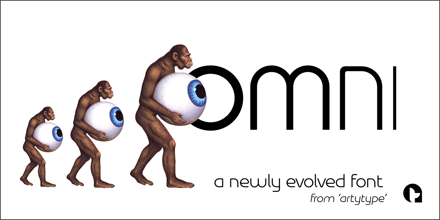
Out of the current ‘Artytype’ collection, Omni has evolved the most, being a stripped back off-spring from several exploratory exercises.
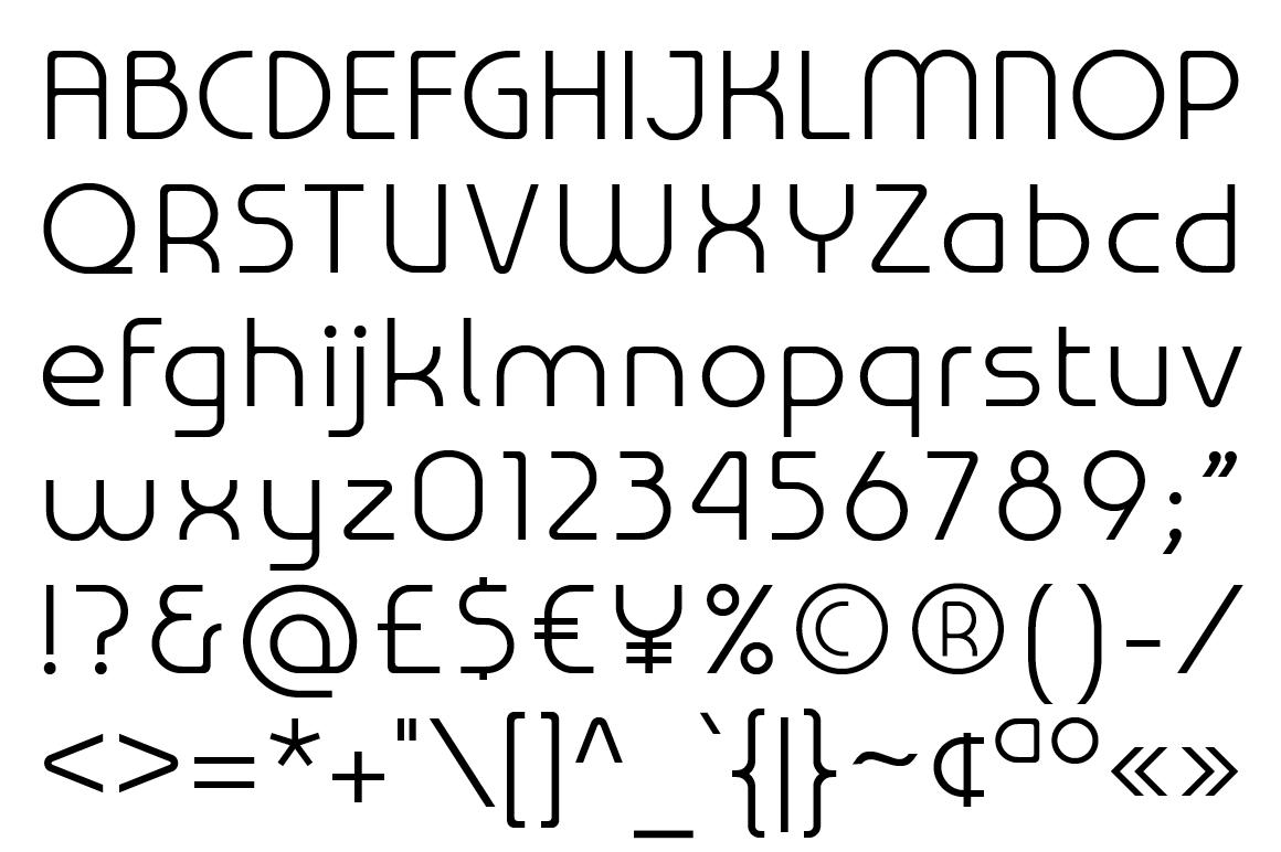
At first glance and particularly at small scale, you'd be forgiven for thinking Omni's basic characteristics have a conventional look and feel; however on closer inspection, it’s own distinctive, clean cut, subtle styling becomes apparent, revealing enough personality to stand alone or complement a wide variety of projects. Subsequently, it’s a font that won't go out of style quickly and may even become a modern classic in time.
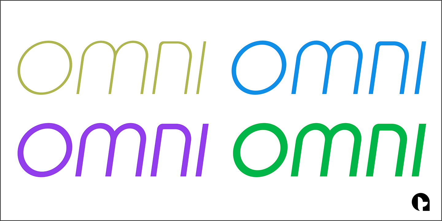
The Omni family has 2 distinct styles, sans and serif, each style being available in 4 weights; all 8 fonts have matching slanted cuts making a total of 16 fonts across both families.
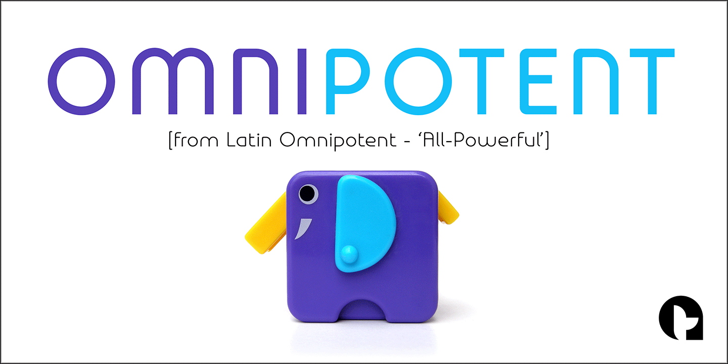
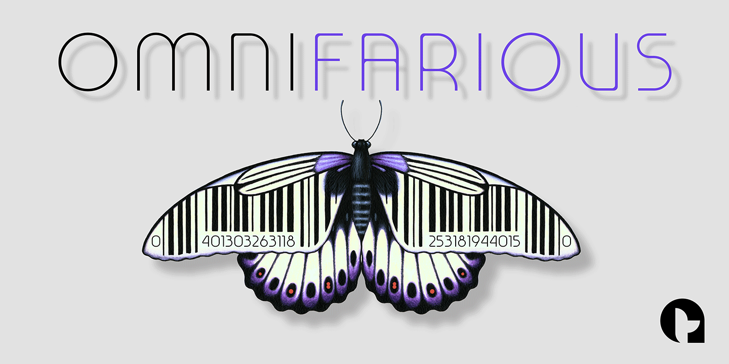
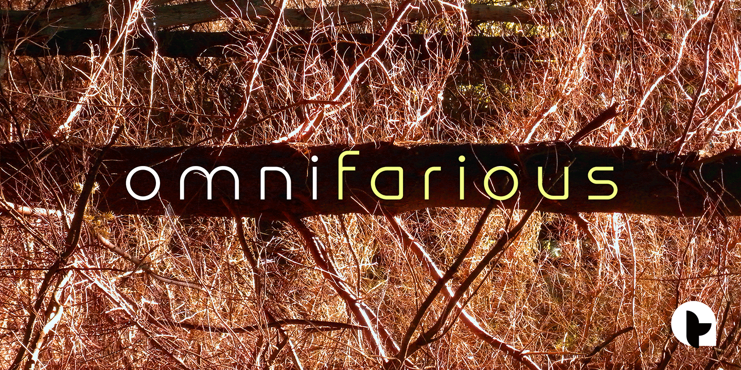
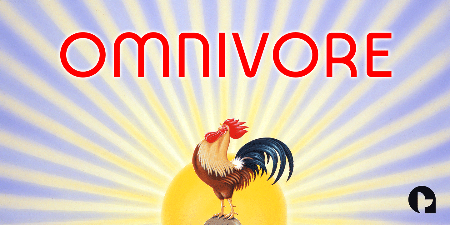
Dictionary definition of OMNI: Combining form - Of all things, in all ways or places. Quite an apt name for a font with ubiquitous aspirations.